
Cholesterol Test
this piece of text is really effective in a way that will shock and scare the reader. first off by having the whole of the text in black and white and then making the word 'cholesterol' bigger, underlined and coloured, it highlights what the text is going to be about and that will make the reader decide instantly whether they will read on or not.
by saying 'final exam' it really accentuates the seriousness of this campaign and will therefore make anyone read on to see how they can prevent the 'final exam'.
'final exam' also works to exaggerate how simple a cholesterol test will be, and so something so trivial as that could save your life.
by using the statistic that cardiovascular disease 'IS' the leading cause of death in Canada,it acts as a kick of reality to the reader that this very well could happen to them if they dont do anything about it.
when it says that 'managing your cholesterol can be quite simple' it shows the reader that something so simple and easily treatable could kill them.
the tag on the foot is also effective because it shows that anyone can suffer from a cholesterol problem, it says that this man who has 'died' of a heart attack is not overweight and is relatively young, which really outlines that this can happen to anyone, no matter what state your general health is in.
 Stop Animal Testing
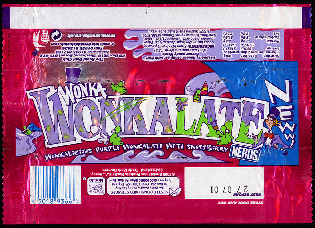 Wonka Chocolate Bar
 Player Piano
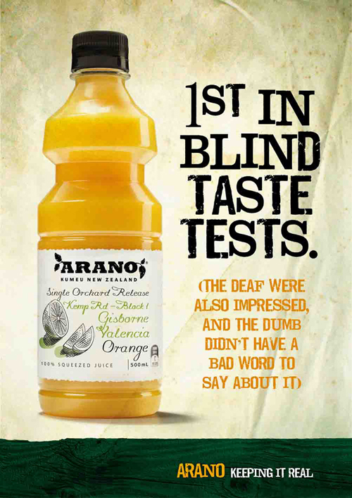 Arano
Arano ABC Children's Dental